Unveiling the DeviantArt Logo Evolution Meaning and Impact on the Art Community
The DeviantArt logo is more than just a brand emblem—it’s a symbol of a vast creative network that has connected millions of artists worldwide for over two decades. From its early roots to its most recent redesigns, the DeviantArt logo reflects the platform’s evolving identity and vision. In this article, we’ll explore the full story of the DeviantArt logo, including its history, design elements, symbolism, and what it means to the global art community.
What Is DeviantArt? A Brief Overview
Launched on August 7, 2000, DeviantArt is one of the largest online communities dedicated to showcasing, promoting, and sharing artwork. From digital illustrations and traditional drawings to literature, photography, and animations, DeviantArt caters to both professional artists and hobbyists.
With over 60 million registered members and 350 million+ unique submissions (known as “deviations”), the platform has become a landmark for artistic expression and creativity. It provides tools for artists to interact, receive feedback, join contests, and even sell their art.
And at the heart of all this creative energy lies a simple, recognizable emblem—the DeviantArt logo.
The Evolution of the DeviantArt Logo
Like many long-standing brands, DeviantArt has gone through several visual transformations over the years. Each change in the logo reflects a new phase in the company’s identity, technology, and user experience goals.
1. The Original Logo (2000 – 2001)
The first DeviantArt logo was informal and somewhat raw, reflecting the early days of the internet. It had a grungy, underground aesthetic—a nod to the platform’s focus on non-mainstream, “deviant” forms of art. This logo wasn’t highly polished but spoke directly to the rebellious and experimental nature of the early user base.
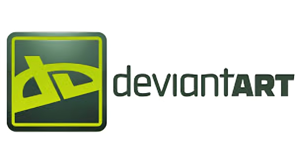
2. The Classic Wordmark (2001 – 2014)
Over time, the platform adopted a more refined green and gray wordmark logo. The letters “deviantART” were stylized with a lowercase “deviant” and uppercase “ART,” emphasizing the creative core of the site. This design stuck for over a decade and became synonymous with the platform’s brand identity.
This version was relatively simple but effective, representing a more mature and accessible platform. Many long-time users still remember this as the “golden age” logo of DeviantArt.
3. The Radical Rebrand (2014)
In 2014, DeviantArt underwent its most dramatic rebranding effort. The company teamed up with design agency Moving Brands to create a bold new look.
The centerpiece of this redesign was a geometrically abstract symbol—a logo formed by slicing a “D” and an “A” diagonally to create a minimalist, angular shape. This new icon aimed to be sleek, modern, and mobile-friendly. The accompanying typeface was custom-designed and featured a bold, clean sans-serif style.
The design sparked mixed reactions. While some appreciated the fresh, modern identity, others felt it strayed too far from the community-driven spirit of the platform. Nevertheless, the logo reflected DeviantArt’s desire to reinvent itself in the age of apps and responsive design.
4. The Wix-Inspired Refresh (2020 – Present)
In 2017, DeviantArt was acquired by Wix.com, a website-building platform. Under Wix’s ownership, the logo and UI received another subtle but important facelift.
The angular “D/A” symbol remained, but it was now supported with a cleaner layout, improved color palette, and more user-friendly design across devices. The brand moved toward a more polished and professional look while retaining the edgy artistic vibe.
This version of the logo—used to this day—represents a blend of innovation and tradition, trying to bridge the old DeviantArt community with newer, tech-savvy creators.
Design and Symbolism of the DeviantArt Logo
The 2014–present logo is the most iconic and controversial in the platform’s history. Let’s break down the key elements of this design:
Abstract “DA” Monogram
At first glance, the logo might appear as a random abstract shape. However, it cleverly incorporates both the letter “D” and “A” from DeviantArt in a split, angular design. It symbolizes:
- Creativity from Chaos: The sharp angles and asymmetric form represent non-conformity—a central theme for a site that celebrates alternative and experimental art.
- Forward Motion: The diagonal slant gives a sense of motion and evolution, aligning with the platform’s constant growth and adaptation.
Minimalism
The simplified style matches modern design trends and improves legibility on mobile devices. The clean structure allows the logo to scale well across different formats, from website favicons to printed merchandise.
Color Palette
The recent branding incorporates a sleek green-gray gradient. The green suggests creativity, innovation, and life, while gray adds neutrality and professionalism. This mix symbolizes the balance between artistic chaos and structured community support.
Why the DeviantArt Logo Matters
A logo is often the first impression of a brand. For DeviantArt, the logo serves several vital roles:
- Identity: It unites a massive global community under a single visual symbol.
- Trust: Artists rely on the platform to protect their work and offer exposure. A strong logo conveys professionalism and reliability.
- Recognition: Whether it’s on social media, merchandise, or digital apps, the DeviantArt logo instantly signals a space where creativity thrives.
Criticism and Community Reactions
Every major logo redesign brings with it some controversy, and DeviantArt was no exception.
Many users reacted negatively to the 2014 rebrand, feeling the new logo was too corporate, overly abstract, or detached from the artistic grassroots of the community. For a platform built on user submissions and peer-to-peer feedback, the sudden shift felt jarring to longtime users.
However, others embraced the evolution, noting that a fresh look was necessary to keep pace with modern digital aesthetics and to appeal to newer generations of artists.
Conclusion: A Symbol of Artistic Freedom
The DeviantArt logo may have changed shapes, colors, and styles over the years, but its purpose remains the same: to represent a diverse, dynamic, and daring community of creatives. Each version of the logo tells part of DeviantArt’s story—from underground art hub to one of the most influential platforms in the digital art world.
Whether you’re a digital illustrator, photographer, writer, or traditional artist, the DeviantArt logo stands as a reminder that art has no boundaries. It’s not just a symbol; it’s a badge of creative freedom and expression.
FAQs About the DeviantArt Logo
Q1: Who designed the 2014 DeviantArt logo?
A: The 2014 logo was designed by the creative agency Moving Brands in collaboration with DeviantArt’s in-house team.
Q2: Can I use the DeviantArt logo in my portfolio or artwork?
A: You may use it under fair use in editorial content or parody, but for commercial use or branding, DeviantArt’s branding guidelines should be followed strictly.
Q3: Where can I download the official DeviantArt logo?
A: The official logo can usually be found in the press or media kits on DeviantArt’s website or by contacting their support team directly.
Q4: What font does DeviantArt use in its logo?
A: The custom typeface used in the 2014 rebrand is unique to DeviantArt and was created in collaboration with Moving Brands.
If you’d like a downloadable version of this article or want it turned into a blog post, social media carousel, or YouTube script—just let me know!

https://t.me/s/beefCaSINo_OfFiCIaLs